DocuSign New Sending Experience is an improved workflow that provides customers with a simple,
focused and educated experience to send documents and get them signed.
Started with a vision
During late 2016, the design team had an opportunity to explore and revise the document sending experience in DocuSign. Based on a collective feedback from our customers, our team came up with a few thoughtful and creative directions and presented to other stakeholders, including our chief product officer. After multiple rounds of design showcases, we got the support from DocuSign and began to construct a better ecosystem for consumers and businesses.What did I do?
As I helped design the experiences, I worked very closely with other stakeholders; product manager, engineers, researchers, and other designers. Together, we were able to deliver a minimum loveable product with a compelling design process. My role involved with user experience (desktop and web-responsive), visual design, and product flow. I also attended research sessions, taking notes and listening to our users when they were testing the new version.Defining The Problems
We had received a collective feedback from customers, here are the 5 pain points that we were focusing on:1. “I don’t know where to start.”
2. “I don’t know whether I should sign or send a document.”
3. “I don’t understand the concept of workflow/signing order.”
4. “I don’t understand why I should tag a document or how to do it.”
5. “I don’t want to waste my 3 free sends.”
Solving The Problems
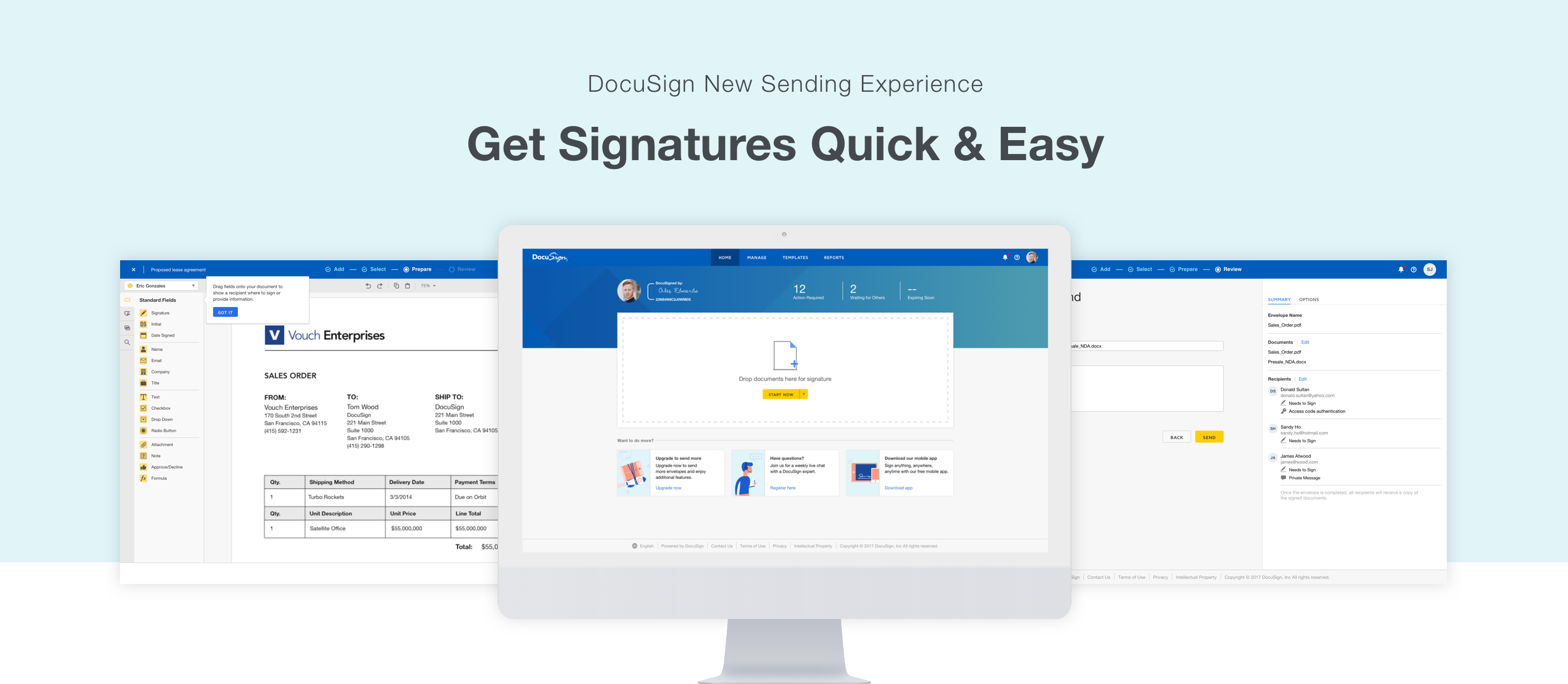
Starting from the pain point, I tried to find solutions to solve them and introduce new features overall to improve the user experience.Homepage Revamp [Ref: Problem #1]
We understand first impression is important, and it is a disappointment to hear some of our new customers were frustrated to begin when they first login. Overall, I’ve made many changes on the current homepage. Bringing a document dropzone instead of a button to start the experience, reorganize some of the information hierarchy and trying to avoid too much information being required to get a result in the first instance.
- Have a brief introduction modal when they first login, it help them to understand through step-by-step instructions that explain the process of sending documents and getting them signed.
-
Rearrange the hierarchy and introduce a document dropzone to be the primary call to action so users can start sending documents in the quickest way possible.
- Repurpose “What’s new” and introduce “Cards” to our customers. These cards will help customers to discover more features in DocuSign, including templates, upgrade plans, live chat assistant, and mobile app. By using colorful and fun illustrations, it will help to digest information from each card.


Breaking the experience [Ref: Problem #2—3]
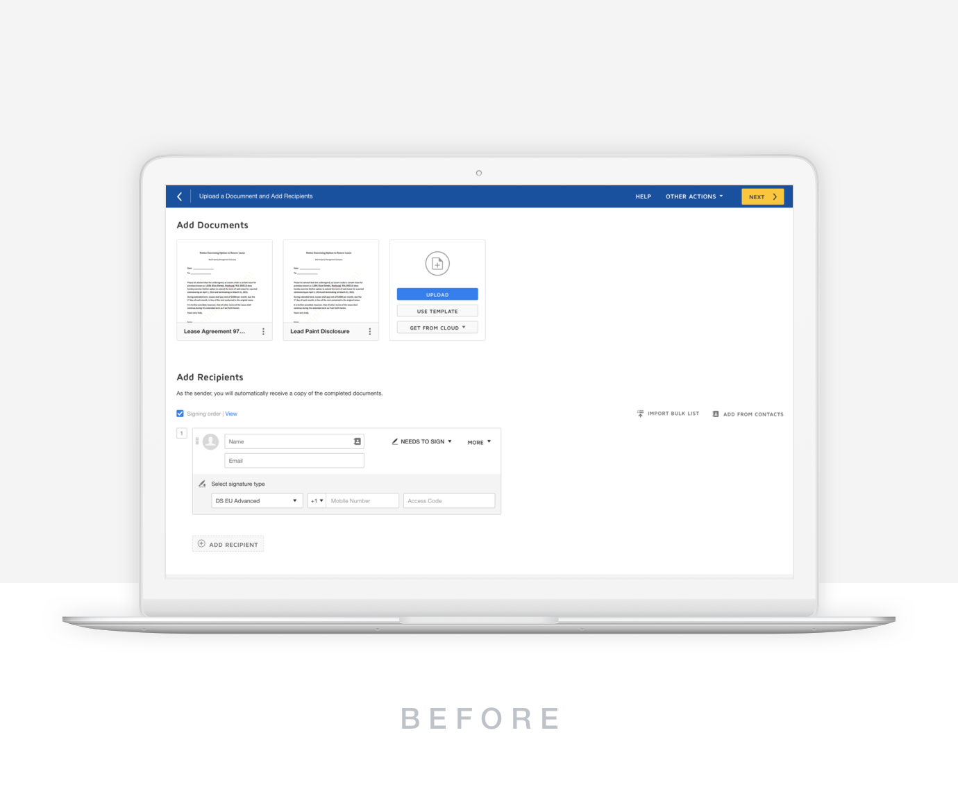
From the current experience, a one-page envelope set up is a bit overwhelming for our users; setting up envelope name, envelop description, upload documents, add receivers/signers, and write a personal message. Because they don’t understand the value of each section or think it is unnecessary, they tend to leave it blank. One of the biggest improvement of the sending experience is to break them into four individual step: upload documents, add signers, place signature fields and send messages. That way, users can focus on one thing at a time and easier to digest.
![]()
From the current experience, a one-page envelope set up is a bit overwhelming for our users; setting up envelope name, envelop description, upload documents, add receivers/signers, and write a personal message. Because they don’t understand the value of each section or think it is unnecessary, they tend to leave it blank. One of the biggest improvement of the sending experience is to break them into four individual step: upload documents, add signers, place signature fields and send messages. That way, users can focus on one thing at a time and easier to digest.
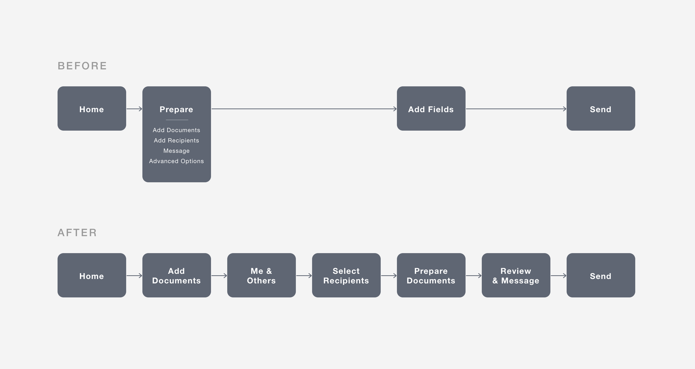

- To help senders differentiate between sign or send a document, we introduce “who needs to sign?” concept. Senders can choose between “Me” and “Others” and goes to different experience; When senders choose “Me”, they will be redirect to a singing experience. When sender choose “Others,” they ,can continue with the experience by entering recipients’ information. If they select both, sender’s signing experience will come up after they send out the document.
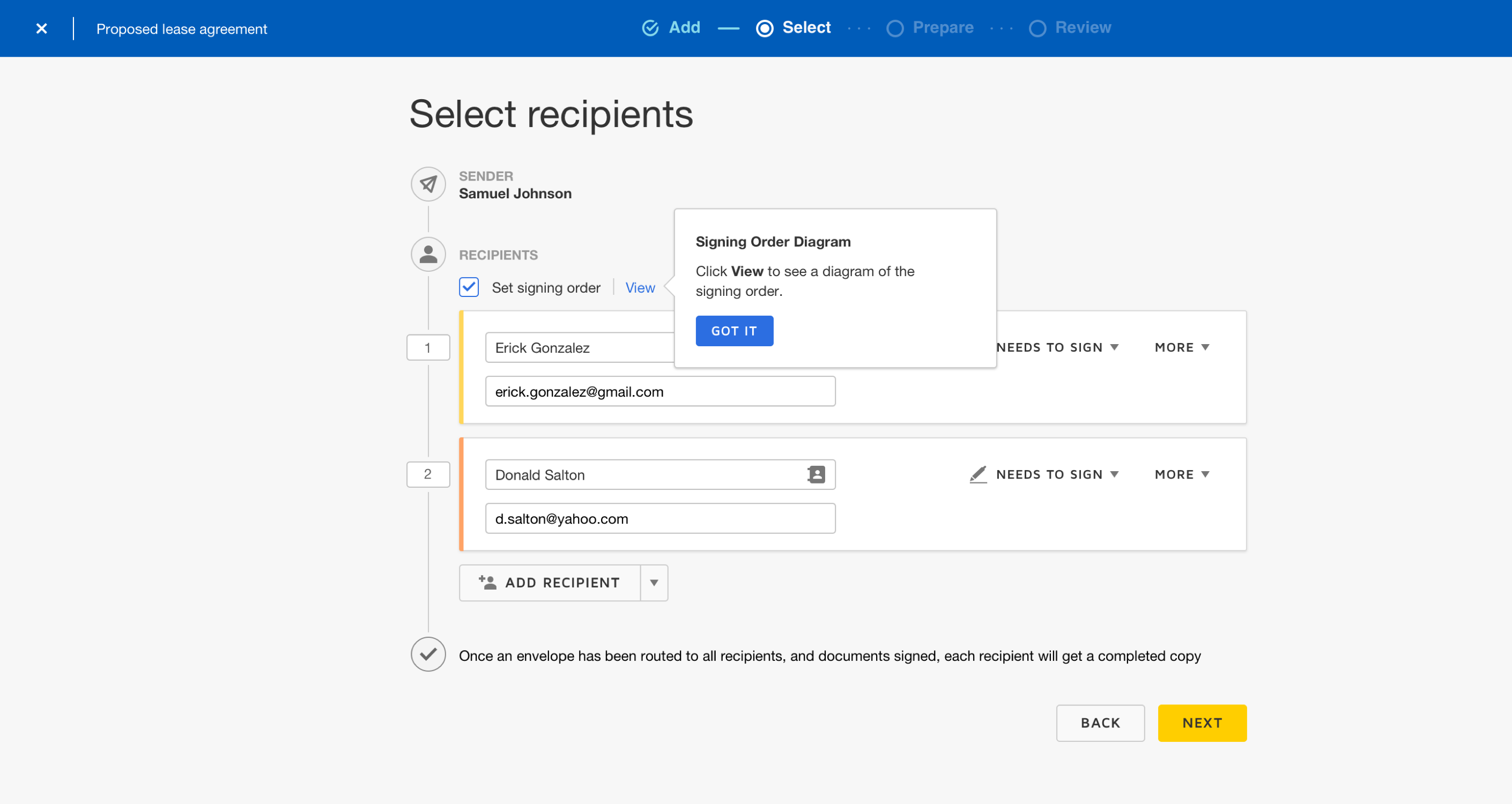
- During the second step—Select Recipient, senders can enter recipient's info and arrange the signing order. This page was designed like a diagram so they can clearly see who sign first.
- The last step is Review, combining message and summary that can help senders check and confirm everything that is ready to go and they can also set up message to recipients when they want to provide further instructions.

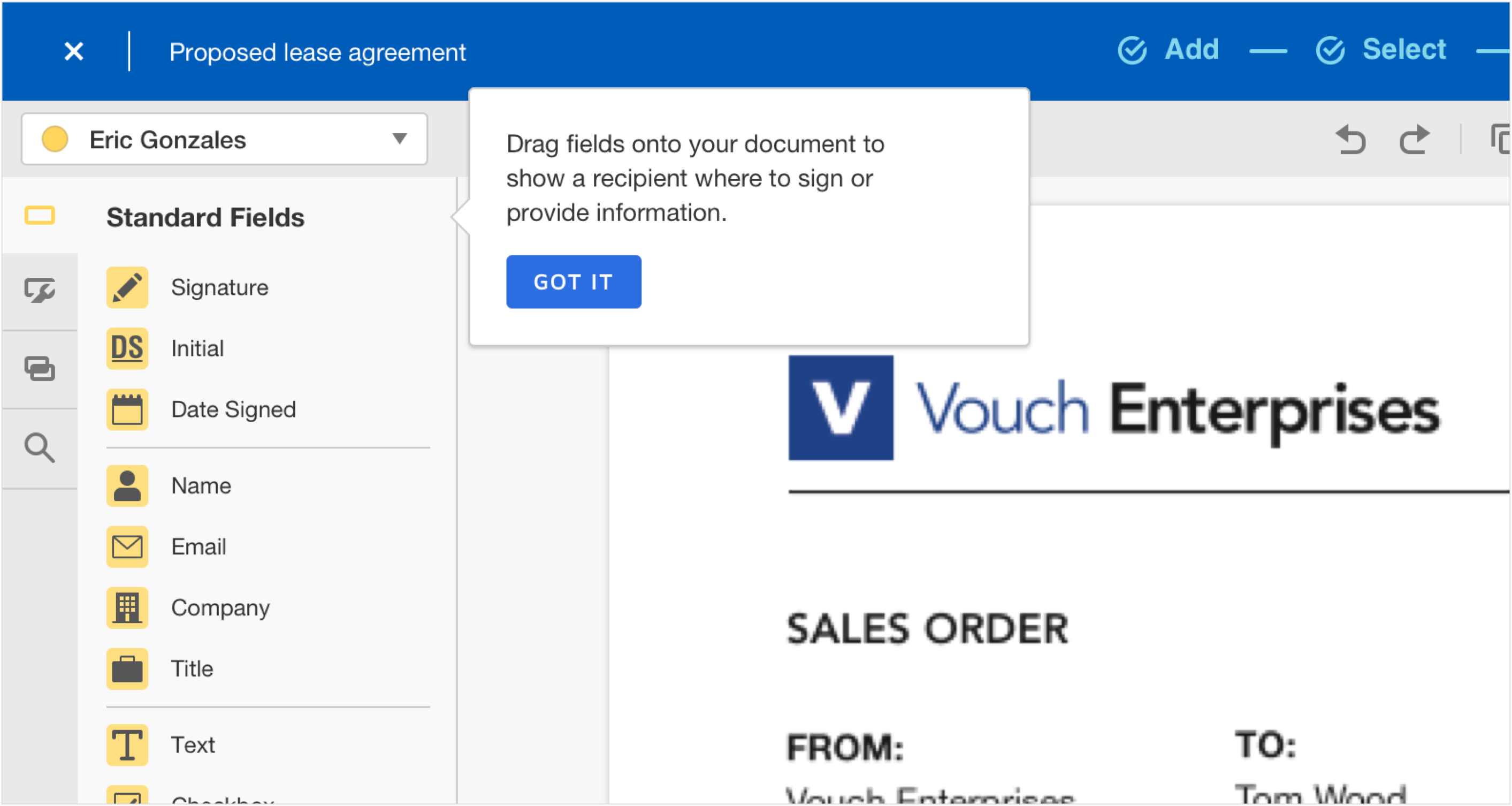
Refine the details [Problem #4—5]
As we were solving some of the bigger issues, we never forget to refine and to improve some of the details in the product.
![]()
As we were solving some of the bigger issues, we never forget to refine and to improve some of the details in the product.
- Working with content writer and refined FTU (First Time User) experience tooltips and modals with instructions so help some beginners to follow through.
- After senders send out documents to their recipients, a post-sending page will appear as confirmation. There are different post-sending pages depending on different scenarios. Some of them will have call to action in order to discover more features. For example, when senders constantly sending the same document, we will suggest them to make a template and prompt the “Make a template” button.
- Instead of showing the countdown meter (some of the accounts have limited sends) from the homepage. We used toast messages and utilized the post-sending page to remind senders when they need to upgrade.


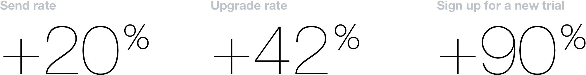
Results & Impact
As we released this product to our customers, we received numbers of positive feedback from them. They were satisfied with the improved experience being intuitive and focus. We were also monetize and measure our users’ behavior by using Mixpanel to track users data. We were able to see what experiment causes the most send rates and using data to find the struggle points. As for the results, not only customers are satisfied with the experience, but also we are able to see a significant positive change compared to the current experience:
![]()
Key Takeaway
- Keep in mind the product ecosystem. However, focus on one feature at a time and doing it well.
-
Involve with stakeholders early and present ideas to them, they might sparks some great ideas sometime.
- Utilize researchers and let them help you to look for the truth.

Check Out These Projects
Braze Canvas Templates / Canvas Collaboration Concepts Study / Splash
3IAB: The Process of Product Development / Splash Identity / Design Is